
We live in a golden age of information. YouTube/articles, for many, has become the university of life, a treasure trove where knowledge flows freely. But here’s the catch: ever found yourself in the middle of a project, frantically trying to recall that one perfect video or article that held the key? Sound familiar?
Regardless of the design process you’ve embraced, whether you’ve meticulously charted out research, user flow, or sketches, the pivotal moment comes: bringing your vision to life in the digital realm. It’s akin to giving wings to your ideas, letting them soar and resonate with others.
Now, let’s talk about the composition of elements. It’s more than just placing items together. It’s a calculated dance, a symphony of components working in harmony. The overall impression, vibe, and message are all anchored in this composition.
Dive in, and let’s demystify the magic behind design composition. Because, trust me, by the end of this article, you won’t just see design; you’ll feel it.
In Design, there’s no final stop, only endless horizons. You need to know the most important basic rules of good Design so that your designs are not products of chance.
As UX designers, we aim to solve problems and create a positive user experience when they engage with a product. To achieve this, we need a visually appealing and intuitive interface that can generate positive and trustworthy emotions in users.
In this guide, I walk you through the fundamental steps of starting your design journey.
Table of Contents
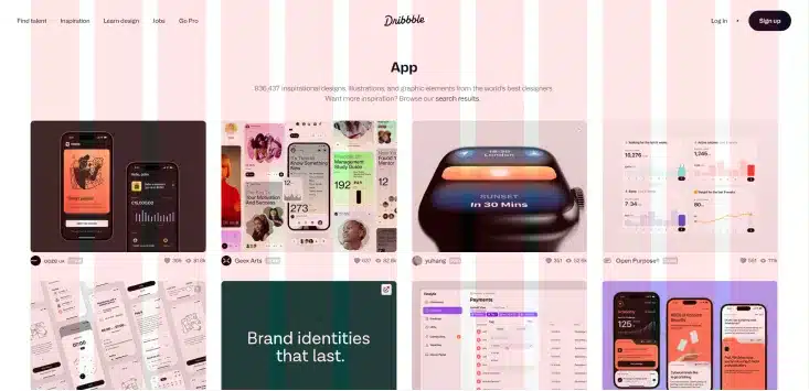
©Dribble website, Fair Use
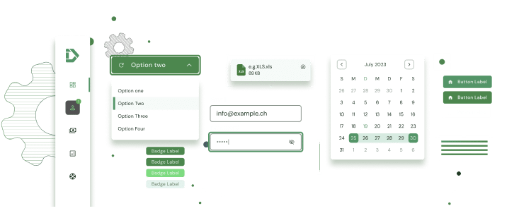
Spacing and Grids
The Spacing and Grids are essential/fundamental things related to designing an app/website. Imagine when organising your bookshelf, it is important to give specific heights for different types of books. Similarly, a grid design can help by allowing particular spaces for other elements to be allotted.
The problem I saw during my journey is that the grids are likely one of the more undervalued visual design fundamentals. On the other hand, they guarantee that the app or website has a consistent visual look. Even though users can’t see the grid, they can feel it if it’s missing. A cluttered and chaotic layout will make users feel lost and frustrated. And they think there needs to be a visual path through the layout.
When creating a grid, it is essential to keep in mind three key elements: columns, gutters, and margins. The columns form the basis of the grid and determine the placement of different elements. On the other hand, Gutters are the gaps between the columns that should be a multiple of the base unit. Lastly, margins refer to the space between the outermost column and the frame.
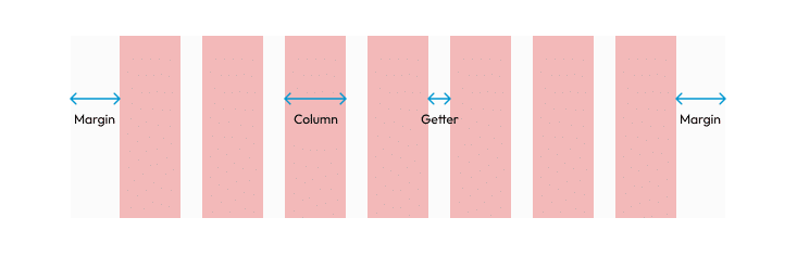
Your grid isn’t set in stone; don’t be afraid to break from it to add a special touch. It’s your Design; breaking the grid can highlight specific elements and make them stand out. However, remember that if you choose to do so, it should serve a purpose or highlight a specific point.
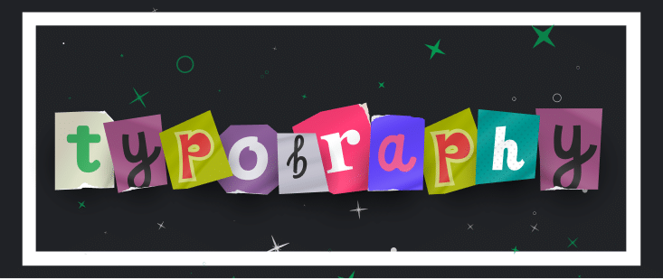
Typography
What is typography? So, interesting question. As Gerrit van Aaken defines the term, “Typography is the art or study of graphic design that is related in some way to written characters”. Typography is the art and science of arranging type to make written language more appealing and readable. While typography is a vast topic and my personal favourite, I’ll provide a brief overview here. Navigate this space wisely, and you’ll find the typeface that perfectly complements your project.
Firstly, let us agree that each typeface has a voice and personality and can affect the project significantly. If you are a beginner in design, it is generally best to avoid decorative, handwriting, and serif typefaces. It sounds crazy, I know, but serif typefaces are not that easy to work with, and you need to be able to set the spacing and the leading, kerning and everything properly for the digital interfaces to work well. It’s better to stick with sans serifs typefaces. I made a list of good free fonts to help you finish your next project: Roboto, Helvetica, Open Sans, Poppins, and Ubuntu.
Another piece of advice: please stay with the regular font and add bold/semibold for your title and subtitle. Avoid the font Thin or light is not going to work; this idea that people have and sync it with the minimal Design. With the launch of iOS 7, Apple announced that it would be updating its system-wide font to Helvetica Neue Light. However, designers almost universally criticised this choice, as the typeface was considered too light and thin for small, lower-resolution mobile screens. Apple has since moved away from Helvetica Neue Light and adopted other typefaces for its user interfaces.
If you need clarification about the difference between typeface and font, check out my Instagram post Font vs Typeface! And if you like it, remember to give it a thumbs up and share it with your friends. 😉
Another aspect that you want to pay more attention to is typography scales! Typography establishes clear hierarchies that are fundamental to creating a good user experience.
In the links below, you can find a tool that can help you create a typography guide for your app or website that you aim to create.
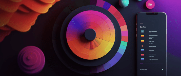
Color
Color is one of the most essential design tools. There are countless colours and combinations you can use – but you should take your time. With a basic knowledge of colours and their meanings, you can avoid producing inappropriate associations or relying on a worn colour scheme.
What I found important is that you need to be aware that colour changes depending on what colours are around them! This phenomenon is called simultaneous contrast. You can find more about it in the reference section. That leads us to the context is the important aspect that we need to consider when we choose the brand/ color palette for the website. With context, our color vision will work in the real world. Humans fail to see the color without something around the edges to compare it to.
If you’re a beginner designer, you need to have a better knowledge of the color that makes you confident! My advice to you is to make it simple! You don’t need a lot of colors! Just like with typefaces, you only need three colors: background, foreground, and accent. How do you do that? It’s so simple. You can use the 60-30-10 rule; I already did an article about it. You can read more about it.
In the reference section, you can find the best tool to generate your next color palettes, like Adobe Color CC, Color Tool – Material Design and color. Be sure to read the article about how to choose colors.

Imagery and Iconography
Imagery
Understanding how to incorporate images and icons effectively is crucial for any designer to convey and distinguish their product. Images and icons can attract attention, communicate the website’s purpose clearly and concisely, and create stunning visual effects that leave a lasting impression on viewers.
I want to share some tips for choosing and designing images:
- The first step when searching for an image is to decide on a style – this is the only way you know what to look for.
- Choose between photography and illustration for consistency. Photos are best for realism, while illustrations add a playful touch and are suitable for abstract concepts and technical drawings.
- Including alt text for images ensures everyone can access the content. Alt text is a brief description of an image that is displayed to users who cannot see the image. Let’s address the elephant in the room – alt text. This small yet significant element, often pushed to the sidelines, is a game-changer in the realm of design accessibility. Everytime you add an image, envision the alt text as its vocal cords. For those unable to view the image, the alt text ensures they’re still part of the conversation. After all, inclusivity is the cornerstone of the modern digital design landscape.
Iconography
As humans, we understand icons through metaphors, which compare them to things we already know. When choosing icons, it is essential to consider the end-user and avoid using icons that are simply cool or visually appealing to you as the designer. For example, an icon that you find cool may not align with the user’s mental model and could slow down their understanding of the interface. It is important to prioritise the user’s understanding and experience over your personal preferences. Moreover, it is essential to choose an appropriate icon, as it can take users up to five seconds to understand an icon that is not clear or relevant.
Bits of Advice to choose an Icon is to consider three elements.
- Consistency: Icons should be consistent across all platforms and iterations. Inconsistency can confuse users and break the intuitive flow of the design. For example, if you decide on a solid style for your icon library, it is best to keep it distinct from outline icons. Consistency in style promotes recognition and usability.
- Size and editability: An ideal icon scales without losing clarity and aligns with the grid system. It should also be easily editable, allowing for adaptability across different designs and resolutions.
- Relevance to the subject and clarity: The icon should directly represent its function or meaning. It is generally advisable to add text labels to icons. Studies have shown that users find interfaces easier to navigate when icons are paired with text labels, as this reduces cognitive load and aids understanding.
UI Element
UI elements are the building blocks of user interfaces for apps and websites. These include menus, input fields, modules, dropdown lists, switches, buttons, checkboxes, and other digital controls. These elements have a purpose, which is to help users interact with the app or website and perform different tasks.
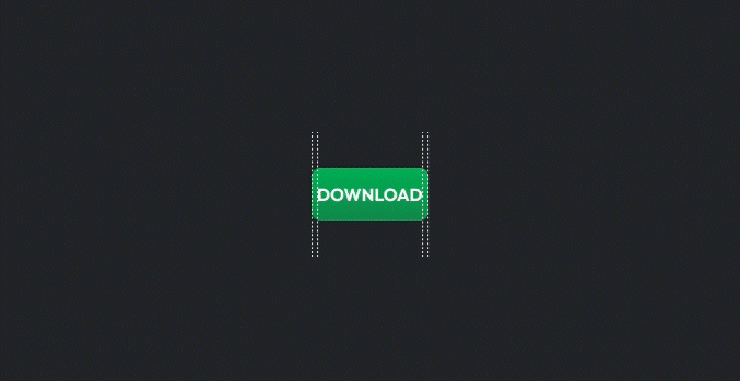
Let’s demonstrate that the call-to-action (CTA) button is the most crucial UI element in most patterns. CTA buttons are important because they are the elements that users interact with to perform the actions that we want them to perform, such as buying, submitting, or applying.
Unfortunately, many CTA buttons are not accessible, misaligned, or untabbable. Additionally, they are often inconsistent in terms of design and placement.
All CTA buttons should have a label that is aligned and properly weighted. They should also have an inner margin (padding), safe space (outer margin), color, and sometimes shadow.

In the GIF, Option A already has the label aligned vertically and horizontally, but the text is too cluttered. As a result, it takes our brains slightly longer to process the information.
Option B demonstrates an easy technique for ensuring that CTA buttons are easy to read and user-friendly.
The Take Away
Design is a journey, not a mere product. It’s about understanding user needs, adhering to core design principles, and constantly iterating to fuse aesthetics with functionality. Getting feedback from users early and frequently is vital. When navigating the vast world of typefaces, choose one that truly mirrors the essence of the business. Similarly, with colors, simplicity often shines brightest. Stick to a three-color palette for coherence and clarity. Remember, your grid is dynamic, not static. Above all, a designer’s mission is to craft experiences that are not only captivating to the eye but intuitive to use. Be ready to evolve and learn, and always place the user experience at the heart of your creations.
References & Resources 🤓
Learn more about How to Use a Grid in Web Design How to Use a Grid System in Web Design
Best font collection for a title The Best Free Fonts, explore more about typography topics by understanding spacing or kerning.
A tool that helps you to manage typeface styles that can be used across an app, ensuring a flexible yet consistent typescale.
My best tool for choosing a color palette Adobe Color
Awesome palette configuration tool material.io
Imagery and Iconography Unsplash Pexels Google Icon
Learn more about UI design best practices for mobile in Google Material Design, Apple Human Interface Guidelines or Microsoft Fluent Design System.


Hi mustafa,
I am keen on coming in a 1:1 session with you. I have completed the course though but still unable to crack through portfolio and figma.
Hi Smriti, so glad that you find that helpful, we can talk about that, contact me in Slack! ✌️