
As a designer, one of the most challenging aspects of creating a great design is getting the color scheme right. Highly recommend it to check out my article How to Choose Your Color Palette Using Color Wheel. Finding the right balance between colors can be challenging, especially when dealing with multiple hues and shades. Fortunately, a simple rule can help you assemble a color scheme that works every time and EVERYWHERE by using the 60-30-10 Rule.

What is the 60-30-10 Rule?
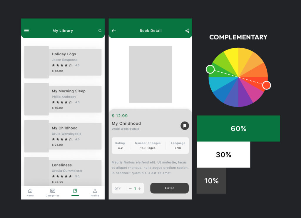
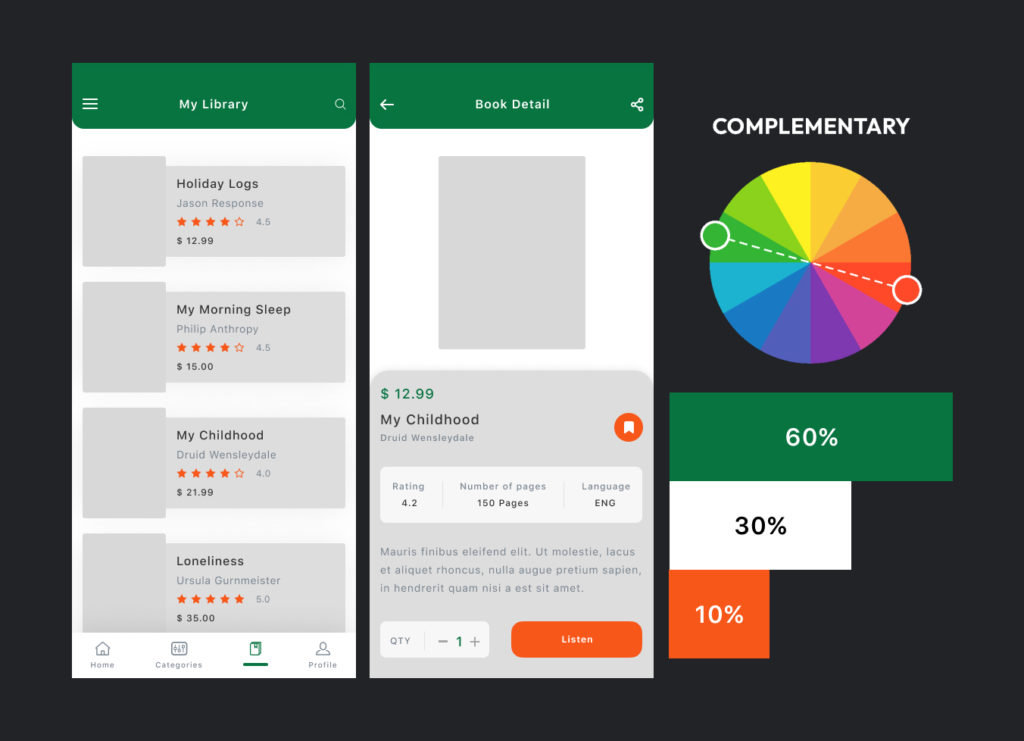
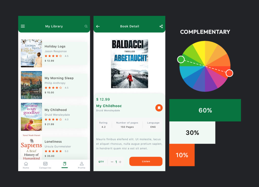
The 60-30-10 Rule is a timeless design principle that’s been around for decades. It’s a straightforward concept that involves using three colors in specific proportions: 60% primary color, 30% secondary color, and 10% accent color. By following this Rule, you can create a harmonious color scheme that looks great and is easy and memorable on the eyes.
In this article, I’ll demonstrate the 60-30-10 Rule in more detail and provide tips on implementing it in your designs.
Understanding the 60-30-10 Rule
Before we dive into how to use the 60-30-10 Rule, it’s essential to understand the logic behind it. The principle behind the Rule is to create a sense of balance and harmony between the colors used in a design. The 60% primary color provides a dominant color scheme, while the 30% secondary color adds depth and visual interest. Finally, the 10% accent color provides a pop of color that draws the eye and adds a bit of personality to the design.
The 60 percent Primary Color
The primary color is the dominant color in the design and should comprise 60 percent of the color scheme. This color sets the tone for the entire structure, so choosing a color that works well with the brand, product, or service you’re designing for is crucial. The primary color is typically used for backgrounds, color blocking, and large text areas. This color should be calming and easy on the eyes, as it will be the most used color in the design.
When choosing a primary color, it’s essential to consider the psychology of color. Different colors evoke different emotions, so it’s crucial to select a color that aligns with the goals of the design. For example, blue is a calming color often associated with trust, while red is a high-energy color often associated with passion, excitement, danger, alarm, and blood. Don’t get me wrong when I mention above the psychology of color. It’s not always right! e.g. In Western cultures, red is associated with danger, love, action, passion, energy and excitement, but it is also the color used in Russia to symbolise revolution and communism. Similarly, in Chinese culture, red is associated with good luck and happiness. I want to say that using color in marketing and advertising can significantly impact consumer behaviour, particularly when creating a brand image or website or app that resonates with the target audience. Dig so well and take your time to find the fit and unique primary color.
The 30 percent Secondary Color
The secondary color is the supporting color in your design and should make up 30 percent of the color scheme. This color adds depth and visual interest to the design and is typically used for headlines, sidebars, highlighting, or text callouts. The secondary color should complement the primary color, but it can be bolder or more vibrant to add contrast.
When choosing a secondary color, it’s essential to consider the relationship between the primary and secondary colors. Colors opposite each other on the color wheel, such as blue and orange or red and green, create a high-contrast color scheme that can be visually appealing. On the other hand, colors adjacent to each other on the color wheel, such as blue and purple or green and yellow, create a more harmonious color scheme.
The 10 percent Accent Color
The accent color is the final color in your design and should make up 10 percent of the color scheme. This color provides a pop of color and draws the eye to specific areas of the design, such as call-to-action areas, buttons, and links. The accent color should be bold and stand out from the primary and secondary colors.
When choosing an accent color, it’s essential to consider the color wheel and the relationship between the accent color and the primary and secondary colors. One common approach is to choose an accent color complementary to the primary color, creating a high-contrast color scheme. For example, if your primary color is blue, you might choose an accent color of orange, which is the opposite of blue on the color wheel. However, you can also choose an accent color analogous to the primary color, creating a more harmonious color scheme. For example, if your primary color is blue, you might choose an accent color of purple or green, which are adjacent to blue on the color wheel.
IMPLEMENTING THE 60-30-10 RULE IN YOUR DESIGNS?
Now that you understand the basics of the 60-30-10 Rule, it’s time to put it into practice. Here are some tips for implementing the Rule in your designs:
Choose your primary color first. This will set the tone for the entire design and make choosing your secondary and accent colors easier.
Use shades and tints of your primary color to add depth and variation to your design. Choose a secondary color that complements your primary color and adds visual interest to the design. Use your accent color sparingly to draw the eye to specific areas of the design.
Experiment with different color combinations to see what works best for your design.
Remember to consider color psychology with the cultural perspective of color when choosing your color scheme.
Don’t be afraid to bend the rules to achieve your desired effect. The 60-30-10 Rule is a good guideline, but it’s not set in stone. Sometimes you may need to tweak the colors or proportions for optimal results.
In conclusion, the 60-30-10 Rule is a simple yet effective way to create a balanced and harmonious color scheme for your designs. By following this Rule and considering the psychology of color, you can make great designs and effectively communicate your message. So next time, if you are struggling with a color scheme, remember the 60-30-10 Rule and use it as a starting point for your design.


0 Comments