 Design System
Pardon Our Pixel Dust!
Hey there! This particular part of our fintech design system is still on the designer's table. We're meticulously crafting some fresh components for a seamless experience. If you spot any unpolished designs, know that we're on it! Your patience and understanding are deeply appreciated. Stay tuned for the final masterpiece!
Welcome to my journey designing a user interface for a hypothetical fintech company, “Fintexe”. As a UX designer with a knack for intuitively guiding users through complex digital transactions, I set out to build a design system that bridges functional gaps and enhances the overall user experience. Despite obstacles like limited inspirational materials and feature documentation, I persevered. This case study unfolds my process, challenges, and victories. It showcases how strategic design can make digital interactions easy, enjoyable, and efficient. Dive in to explore a testament of tenacity, creativity, and unwavering commitment to improving user experiences.

The Challenge
“Fintexe”, a hypothetical fintech company, faced a common yet complex issue – maintaining a consistent, intuitive user interface across its expanding digital ecosystem. With an array of distinct products and services, creating a unified user experience posed a significant challenge. The design system needed to be not only cohesive and user-friendly but also scalable and easily maintainable to accommodate future updates. This challenge served as a test of my UX expertise and an opportunity to push the boundaries of the Figma platform. The goal was set; it was time to dive into the design journey.

The Result
The culmination of this meticulous process was a comprehensive design system that effectively addressed the challenges Fintexe faced. The design system, built with Figma, served as a ‘single source of truth’, ensuring design consistency across the array of Fintexe’s products and services.
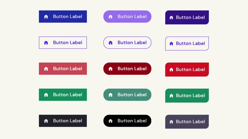
- Unified Visual Language: By creating a style guide that outlined the color palette, typography, and other visual elements, a unified visual language was established. This brought visual cohesion across all interfaces, providing a seamless user experience.
- Reusable Component Library: The component library was a repository of reusable UI elements. This sped up the design process and maintained the integrity and consistency of the UI design across various platforms and devices.
- Scalable System: The design system was crafted to be flexible and scalable. This allows for easy updates and the addition of new functionalities, ensuring the system stays relevant as the product evolves.
- Well-documented Guidelines: Detailed documentation was provided to instruct users (designers, developers, etc.) on how to use the styles and components included in the system. This facilitated collaboration, making the design-to-development process smoother and more efficient.
- Iterative Improvement: Continuous iteration and improvement were integral to the process, leading to a refined and user-friendly design system. This iterative approach ensures that the system continues to serve user needs effectively.
Explore & Experience: Dive into the Demo! 🚀
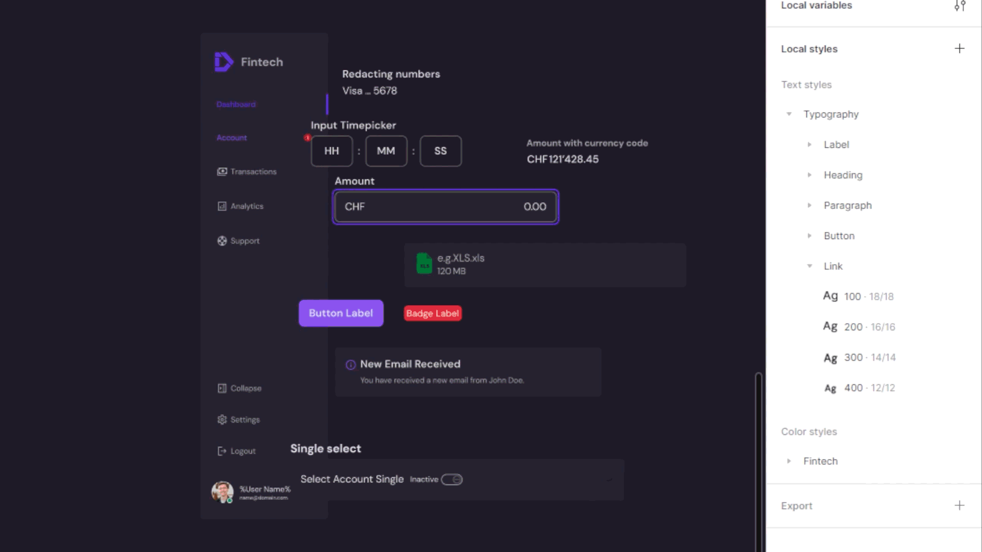
Field component
Configuration
Size
State
The Process
Audit existing designs
Gathering and reviewing all the existing user interface elements, patterns, and components is the initial step in creating a design system. This process aided me in comprehending what I have at present and recognizing disparities and prospects for enhancement.
Define design principles
Design principles act as the foundation of the design system. They provide a clear understanding of the overall design approach and guide design decisions throughout the process.

Create a style guide
The style guide is a crucial part of the design system. It includes the color palette, typography, iconography, and other visual elements that will be used throughout the designs.
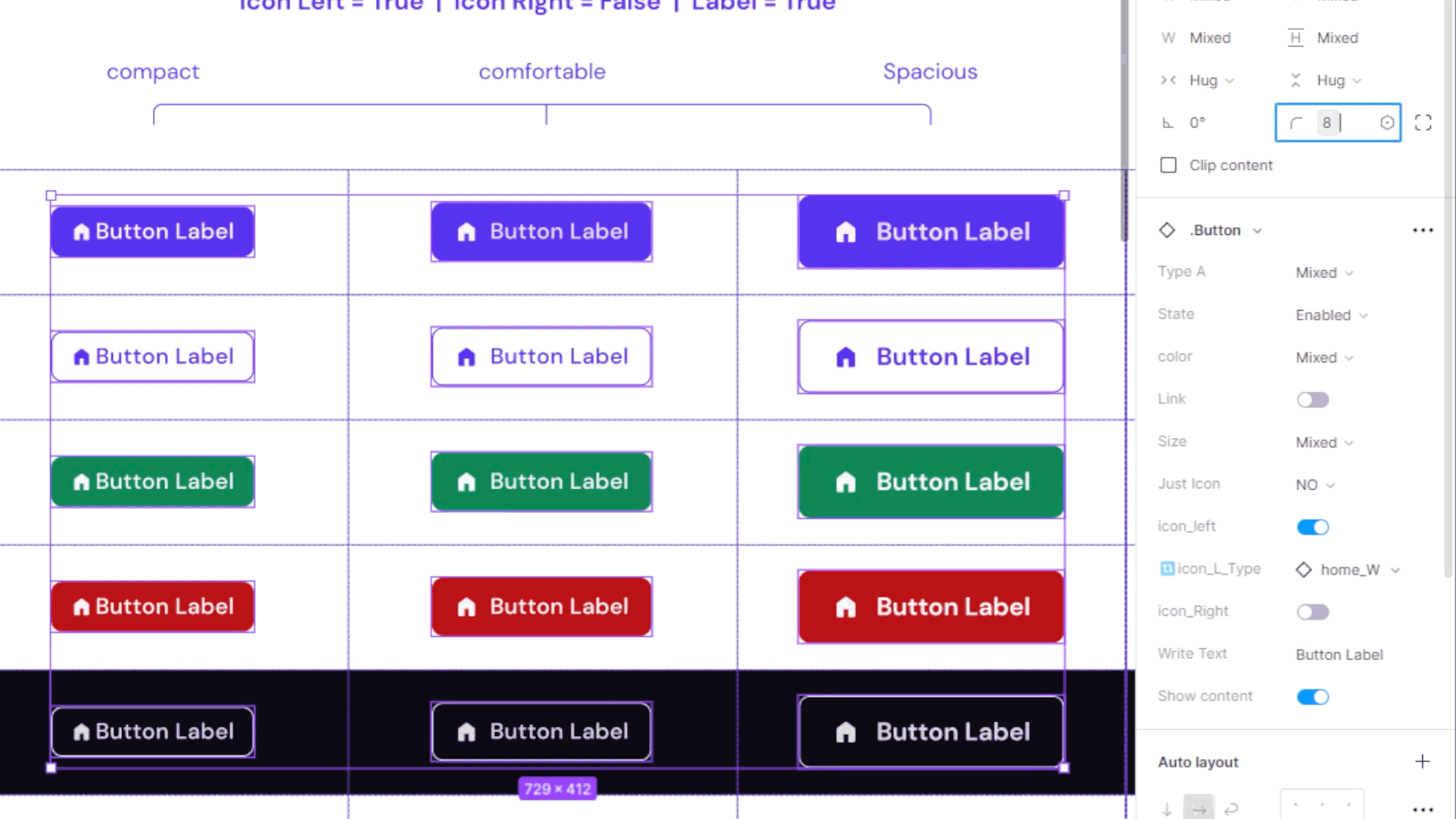
Develop a component library
A component library is a collection of reusable UI elements such as buttons, forms, menus, and other interactive components. This helps ensure consistency across designs and speeds up the design process.

Iterate and improve
The design system is not a one-and-done project. It should be continuously updated and improved based on user feedback and business needs.

Implement and maintain
Once the design system is complete, it needs to be implemented across the products and maintained over time. This ensures it stays relevant and useful as the product evolves.
Tailored for Personalization
Each element and design element has been fine-tuned for rapid, seamless personalization and enduring sustainability.
Components
Crafted with diverse variations and component attributes, ensuring effortless application and adaptability.
Color Styles
Intelligent color styles featuring harmonized tones grant you the freedom to modify your color palette using a solitary input.
Text styles
Harmonious text layers consistently integrated into all visuals, ensuring convenient modification with just one adjustment.
Enhancement
This holistic approach to optimization facilitates not only immediate customization but also guarantees long-lasting coherence in your design journey.