Turning User Frustrations into UX Triumphs
A Case Study on a Local School App – Klapp
Welcome to a transformative journey where small design changes make a huge impact! This case study explores the Klapp Mobile App, a specialised communication solution for education. The app aims to simplify interactions among teachers, parents, and students by centralising important information such as messages, calendars, and absences. Discover how improving the UX of even a localised service like Klapp can offer universal lessons in user experience design.
Overview
Klapp is an integrated communication platform designed exclusively for educational settings. With Klapp, teachers, parents, and students can communicate seamlessly, manage calendars, and report absences, all within a single interface. The app centralises critical information; it should allow users to access what they need in a streamlined, efficient manner. Klapp is available on mobile and web platforms, emphasising functional design over aesthetics.
Target users
The primary users of the Klapp app are parents, teachers, and school administrators. The app is designed to meet the needs of these specific user groups in the following ways:

What the case study is about?
This case study explores the mobile and web versions of the Klapp app, emphasising functional design over aesthetic considerations. In this case study, We focus intently on two essential features: Sign-In/Signup and Absence Reporting. We aim to identify usability challenges by critically analysing these areas and proposing actionable recommendations. Ultimately, our goal is to enhance the user experience in ways that benefit parents, school leaders, and the broader community.
Why it’s crucial?
Educational institutions lie at the heart of our communities, and the technological tools they employ become vital conduits for dialogue among parents, educators, and students. Subpar user experience within such a critical framework doesn’t just frustrate end-users—it actively impedes efficient communication. By spotlighting the UX challenges and opportunities within the Klapp app, this case study aspires to underscore the importance of intuitive design. The insights gleaned here have the potential to guide UX improvements that can significantly benefit not just local schools but educational communities at large.


Project Timeline
Day One
Apply Heuristics and USE Scorecard
Identify issues

Day Two
Define the Flow
Sketching the Flow with the solution
Day Three

Turn the sckeach into midfidality Prototype
What methodology was used
This study used two key methodologies to scrutinise the Klapp Mobile App’s user experience: Nielsen and Molich’s Heuristics and the USE Scorecard.

Nielsen & Molich’s Heuristics
Nielsen and Molich’s Heuristics: This foundational set of 10 guidelines enabled us to assess broad design aspects. The heuristics range from the visibility of system status to error prevention, giving us a comprehensive look at usability. They include factors such as ‘Visibility of system status,’ ‘User control and freedom,’ and ‘Error prevention,’ among others. This methodology helped us gain a macro-level understanding of usability issues, including the need for better error prevention and consistency.
USE Scorecard
The USE Scorecard (Usable, Satisfying, and Easy) provides a more targeted evaluation. The scoring system is easy to implement, rating features based on how well they harmonize with the user’s context, prevent errors, and offer an intuitive interaction. For instance, we found that the app could improve its ‘Satisfying’ score by making icons and visual elements more easily interpretable. Additionally, the ‘Easy’ score pointed out that although the app does a decent job in not requiring a steep learning curve, there’s room for improvement in guiding the user on ‘what to do next.’ By using both approaches, we not only identified broader usability issues but also zoomed in on specific functionalities that needed improvement. These methodologies helped us generate actionable recommendations, offering a well-rounded analysis of Klapp’s UX design.
Objective of the study
This UX case study aims to elevate the Klapp Mobile App by identifying and addressing usability pain points, specifically in the Sign-In/Signup and Absence Reporting functionalities. Our overarching goal is to transform the app into a more user-centric platform—usable, satisfying, and intuitive—thereby enhancing satisfaction and encouraging long-term engagement among parents, teachers, and school administrators.
As both a father of two Kids and a seasoned UX/Product Designer, I bring a dual lens to this analysis. On a personal level, I interact with the Klapp app daily, staying informed about my children’s academic updates and reporting their absences when needed. Professionally, I couldn’t help but notice multiple opportunities for improvement. While I understand that the current iteration is an MVP (Minimum Viable Product), I believe that even MVPs must nail the basics of user experience to be truly effective.

Methodology
Sign-In/Signup Observations
- Unwelcoming Title: “New to Klapp?” lacks a welcoming tone.
- Messy Input Fields: Illogical organisation hinders user navigation.
- Inconsistent Login Options: Social logins are missing in some places.
- Ambiguous Labels: “Continue with Other Services” is unclear.
- Missing Close Button: The absence of ‘X’ button leads to confusion.
- Language Clarity: Language options are not straightforward.
- Misleading Tooltips: They add confusion rather than clarity.
- Overcomplicated Passwords: Multiple steps disrupt the flow.
- Invisible Error Messages: Their location hampers quick resolution.
What IF!
- Title: Use “Join the Klapp Community!” for a warmer welcome.
- Input Fields: Group them logically.
- Login Options: Ensure consistency or tailor for user types.
- Labels: Simplify to “Other Login Options.”
- Close Button: Add a visible ‘X’ or ‘Close’ button.
- Language: Use full language names position centrally.
- Tooltips: Make them descriptive, not confusing.
- Password Steps: Streamline for easier use.
- Error Messages: Place them near the related field.
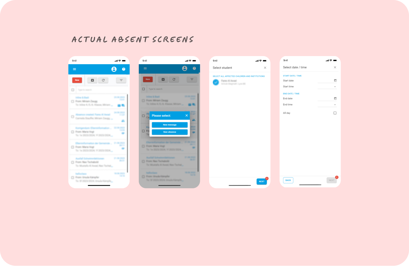
Absence Reporting Observations
- Redundant Student Selection: Limits on one email per student add confusion.
- Hard-to-Reach Reporting: Too many clicks to reach the absence feature.
- Pop-Up Hassle: The pop-up design hinders task flow and discoverability.
- Unclear ‘Next’ Badge: Its purpose isn’t immediately apparent.
- Delayed Error Feedback: Error messages aren’t timely or near related fields.
- No Guidance on Selection: The process of selecting a student is unassisted.
- Missing Confirmation: No summary screen to review/edit absence info.
- Status in the Dark: Lack of tracking for absence request status.
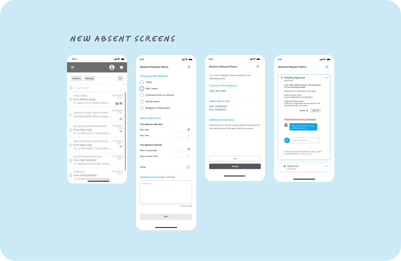
What IF!
- Streamline Student Selection: Auto-select if only one child is linked to an account.
- Quick Access: Add an “Absence Report” tab on the dashboard.
- Dedicated Section: Replace the pop-up with a distinct section for absence reporting.
- Clarify ‘Next’ Badge: Specify its purpose with text or a tooltip.
- Real-Time Error Messages: Display errors close to their respective fields.
- Guidance on Student Selection: Implement tooltips or mini-tutorials.
- Add Confirmation Step: Enable a summary screen for review/editing.
- Absence Request Tracking: Create a status-tracking feature for parents.


Conclusion
Our in-depth analysis assessed the UX design of the Klapp platform, focusing on two key functionalities: the Sign-In/Signup process and the Absence Reporting feature. We identified areas of strength and weakness using Nielsen and Molich’s Heuristics and the USE Scorecard to provide actionable recommendations.
Key Takeaways
Sign-In/Signup:
- The user experience lacks a welcoming atmosphere and has inconsistencies in login options.
- There’s room to simplify and clarify the user interface for ease of use.
Absence Reporting:
- The current design has several friction points, making the process cumbersome for users.
- Streamlining and providing real-time feedback can significantly improve the user experience.


Related Projects


Venus Air – UX Case study
Venus Air – UX Case study

Online Physiotherapy
Nutrition Landing Page

Fintexa UI Kit – Design System
Fintexa UI Kit – Design System
We hope you enjoy exploring the project.